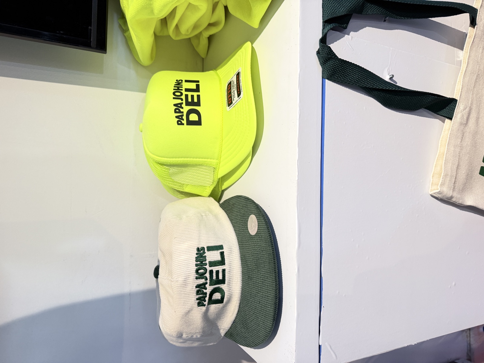
Ask ten printers what a Pantone match means and you get ten slightly different answers. Ask them at six o’clock on a loading dock with a line already forming and the answer gets shorter: close enough, fully cured, keep moving. Handling screen printing ink colors and Pantone matching at events is less a chemistry problem than a decision problem — deciding weeks ahead which colors you will defend and which ones you will let go.
Here is how color actually behaves on a live press, and where planners usually lose the argument.
The PMS system was built for offset ink on coated stock. That is why the same number lives in a Solid Coated book and a Solid Uncoated book and looks like two different colors. Garment ink inherits the same problem, worse: plastisol mixing systems use pigment recipes keyed to PMS values, but the finished ink sits on a woven surface that scatters light in every direction.
What you should expect is a match that reads correct next to your brand guide at arm’s length under normal room light. What you should not expect is a numeric match measured with an instrument. If a vendor promises that on a cotton tee at an event, they are quoting a lab spec they cannot hold on a moving press.
Practical version: bring the Pantone number, but also bring the reason. “This has to look like our packaging” and “legal requires this exact orange” get handled differently. The first is a judgment call the printer can make well. The second means you need a physical approval sample before anyone books a truck.
A Pantone number is a promise about paper
The shirt underneath is half the color
Ink is not opaque paint. Print a warm red directly onto a black tee and you get maroon. To keep a bright color bright on a saturated garment, the press has to lay a white underbase first, flash cure it, then hit the color on top. That is a second screen, a second station, and roughly double the handling per piece.
So garment color is a throughput decision as much as an aesthetic one. Light garments and heathers let most colors print direct at full speed. Black, navy, and forest all want an underbase. If a client wants their brand color to be the loudest thing in the room, the cheapest way is usually to make it the garment and print white or black ink on top — one screen, no flash, full speed.
Color Count
One color flies, two is fine, four is a different event
Every ink color is its own screen, its own head on the press, and its own registration check. Live screen printing is at its best on one- and two-color art, which is why the strongest event designs tend to be bold line work rather than gradients. Add a third and fourth color on a manual press and registration drifts as the day heats up; every drift is a piece you cannot hand to a guest.
Two colors is the honest live ceiling for most events. When the brand genuinely needs full-color art, the better move is to run it on a DTF station beside the press and reserve the screens for one hero design. You keep the theater of the squeegee and you stop pretending a manual press is a four-color offset machine. Our services page lays out which methods pair well side by side.
Two colors that match under daylight can visibly separate under an LED wash or tungsten uplighting. Ballrooms lit warm make cool greys read brown; a gymnasium under old fluorescents pushes everything green. If your on-site approval happens under amber uplights at 7pm, remember that guests will judge the shirt in a parking lot tomorrow morning.
Two habits fix most of it. Approve strike-offs by a window or under a neutral 5000K lamp, never under the venue’s show lighting. And when you place the station, look for a spot with some usable ambient light — both so the crew can spot a misprint and so the finished piece looks like what the guest expected. Cost implications of extra screens, underbases, and station count are broken out on our pricing page, and the planning guide covers the rest of the timeline.
Venue lighting will change your mind
Frequently asked questions
Can you match a Pantone color exactly on a live press?
You can get very close, but a Pantone number describes ink on coated paper, not pigment sitting on woven fabric. Plastisol mixing systems are built on PMS recipes, so a good shop will land within a shade that reads correct beside your brand guide. Treat spectrophotometer-level matching as a lab claim, not an event claim. Approve a strike-off on the actual garment and you will avoid almost every color argument.
Does printing on dark shirts slow the station down?
Yes, meaningfully. Any bright color on a saturated garment needs a white underbase, which means a second screen, a flash cure between hits, and roughly double the handling per piece. If throughput matters more than the exact shade, put the design on a light garment and print direct. If the dark shirt is non-negotiable, budget for fewer finished pieces per hour.
How late can we change an ink color?
Ink gets mixed in the shop before the truck loads, so plan to lock color with the rest of the artwork about ten business days out. Small swaps between stock colors are sometimes possible inside that window. A custom mix, a neon, or a metallic is not, because those need a physical strike-off and a batch you have actually seen.
Next Step
Send the art and the numbers
If you have a Pantone value, a garment color, and a rough headcount, that is enough for us to tell you whether it prints direct, needs an underbase, or belongs on a different method entirely. Call (562) 614-4800 or send your event details and we will come back with a straight answer before you commit to a garment order.